

My Role
Brought on as a full-stack solo product designer, I was tasked with exploring solutions so that expert tax review is efficient enough to handle at scale, reducing 15% of flagged cases without overwhelming the team's capacity or further compromising tax compliance.
Enable tax experts to quickly identify, prioritize, and resolve high risk cases without adding headcount?
Resolve exceptions using existing systems and data without rebuilding the tax automation infrastructure?
How might we
How might we


Final prototype
(For NDA purposes, I have obfuscated confidential material and all information in this case study is my own. Final screens and this case study does not necessarily reflect the views of Kroger).
Kroger Sales Tax POS Compliance Tool
Role
Full-stack Solo
Product Designer
1 PM
1 scrum master
2 tech Leads
3 developers
2 Business Sponsor
Functional Team
Data Team
Team
Timeline
Oct 2023 - June 2024
Contributions
Product Strategy
UX Research & Testing
Interaction Design
Wireframing
Design Systems
Facilitating
Prototyping
Automation found the errors. Experts had to fix them. We made it possible.
When Kroger introduced new automated tax classification services for 3 million products, this transition created a growing business risk: 18-20% of newly added products and store locations were flagged for potential errors. This created thousands of daily exceptions and significant audit exposure.
I owned the research and product design of a management platform to resolve tax code inconsistencies for Kroger’s incoming products by aligning user mental models with system requirements, reducing 15% tax code errors.
TL;DR
The challenge
The bottleneck was expert review capacity, not detection.
Tax experts were already the most accurate reviewers in the system but they had no way to work at the scale the system demanded. Kroger’s internal automation processes surfaced potential errors but couldn’t decide which ones mattered first, or why. So, we decided to amplify the Corporate Sales Tax Team’s decision-making. The real problem wasn't detection. It was capacity, confidence, and control.
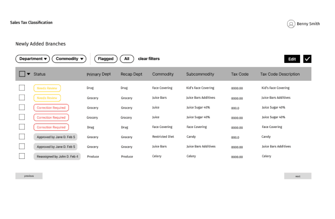
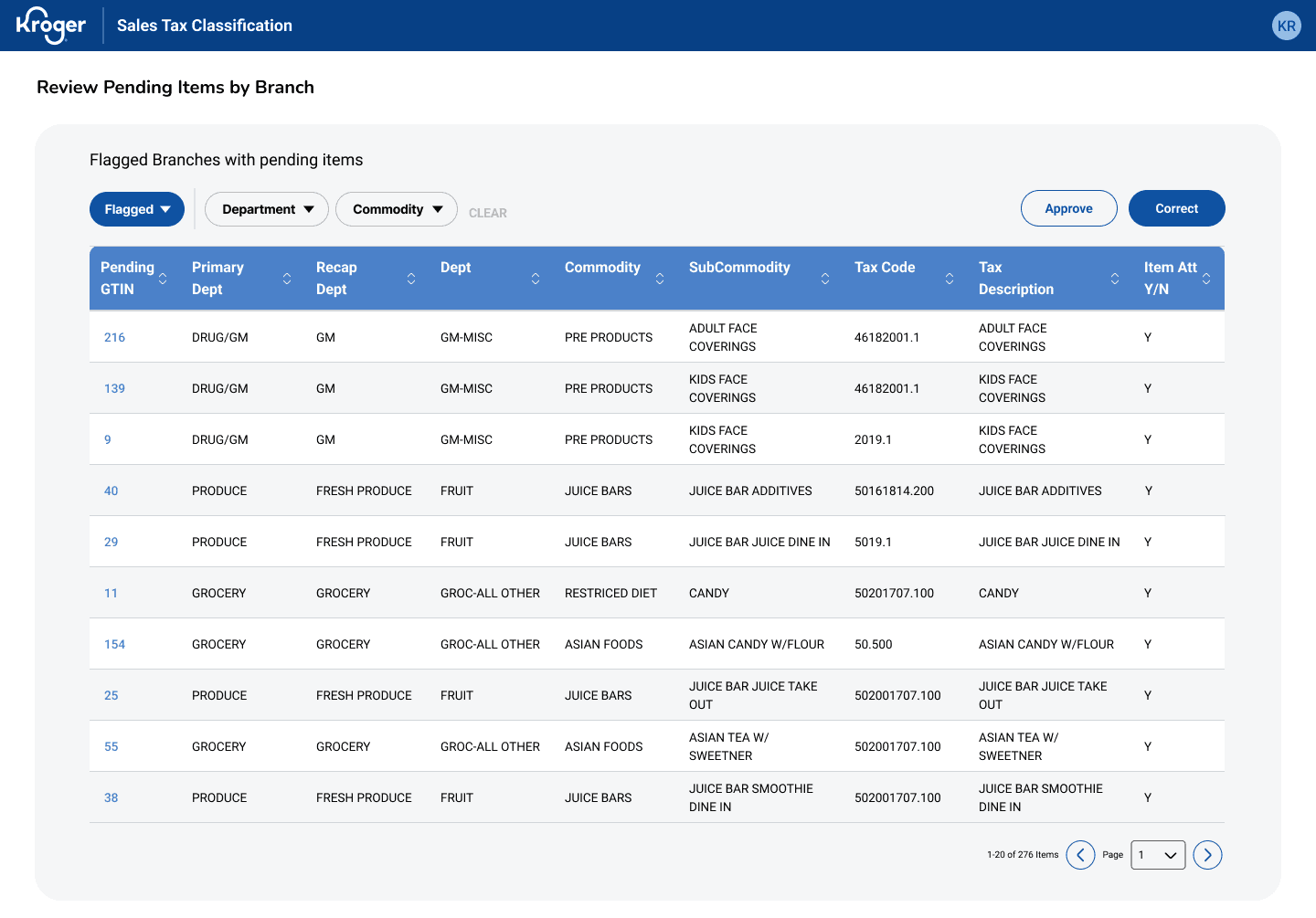
Main Table View
Identifying and prioritizing high-risk cases
the solution
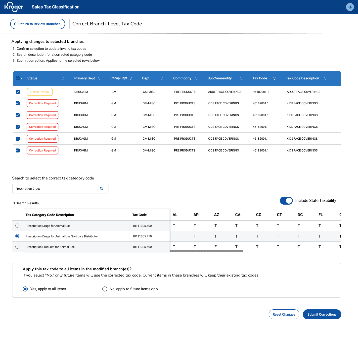
For users processing hundreds of items daily, we optimized pattern recognition with a visual flagging system that surfaces invalid tax codes immediately and a data table design for fast batch decision-making rather than forcing individual evaluation of every row. Marked below are key affordances allowing quick decision-making for high-volume workflows.
83% fewer clicks, 80% time saved, $500K–700K reclaimed.
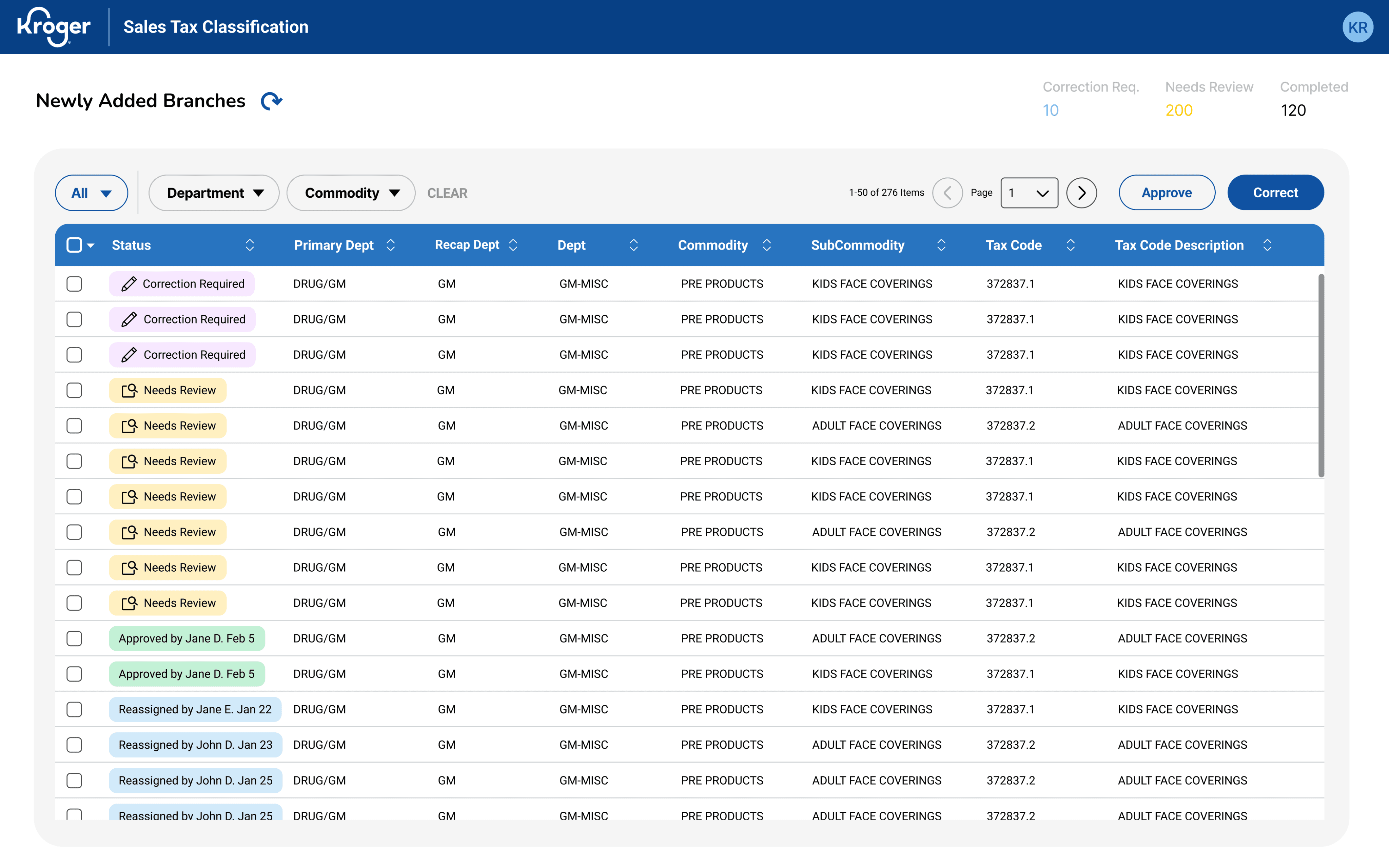
[View only
Flagged v. All Items]
Reduces context switching & users can track progress
[Risk flag indicators]
Color-coded flags highlighting invalid items during scan reduces context switching
[Strategic column order]
High-priority info placed leftmost
[Statuses v. Flags]
Clear row hierarchy guides eye to the most important data first
Users sifts through lists and errors aren’t consistently categorized so cognitive effort goes into finding instead of resolving the items.
Prioritization is unclear.
Store addresses and company codes trigger separate manual correction, so there are actually TWO review workflows:
1. Item Review and 2. Facility Review.
Facility errors are a separate but parallel problem.
User’s current workflow is fragmented and excel-heavy. The problem isn’t volume alone but poor visibility into all that noise.
Friction is in navigation & data consolidation.
Users need to feel confident maintaining data accuracy and handling special cases.
So, transparency matters more than speed.
Experts need confidence & traceability.
User research
Through several stakeholder and user interviews, I discovered the challenge wasn’t tax calculation but managing exceptions at scale. Experts were already working across multiple systems and with limited visibility, users had to resort to manual reconciliation using only excel files as well as these other main pain points:
How do you build a scalable compliance tool for experts who were NEVER part of the original workflow?
planning for product evolution
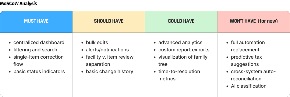
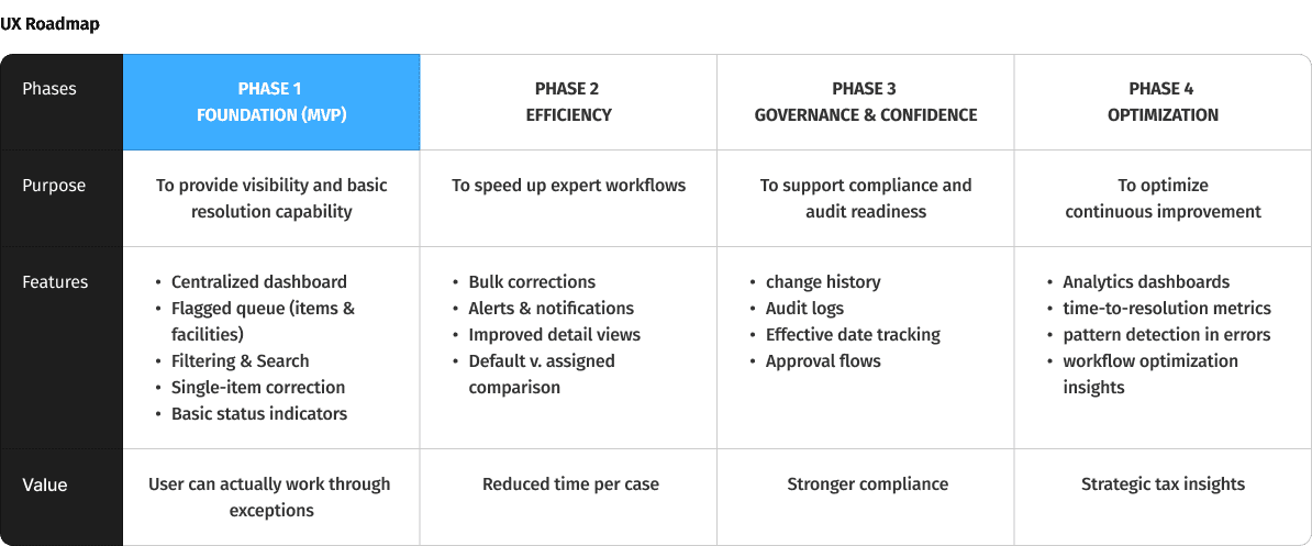
Before further user testing on current workflows, the team workshopped technical limitations for our generated features and finalizing our vision and phases with a MoSCow Analysis and a UX Roadmap, we were able to get leadership buy-in for our current scope, near future, and future alignment:

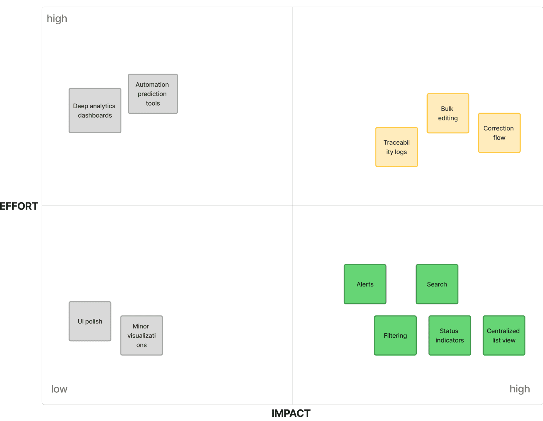
Impact Effort Matrix
defining scope
Given timeline and integration constraints, with my PM and 2 Tech Leads, I prioritized these features to improve expert visibility and decision-making first for MVP before pursuing any deeper automation.
These insights led to requirements focused on centralized visibility, prioritization and confident decision-making.

Process Flow
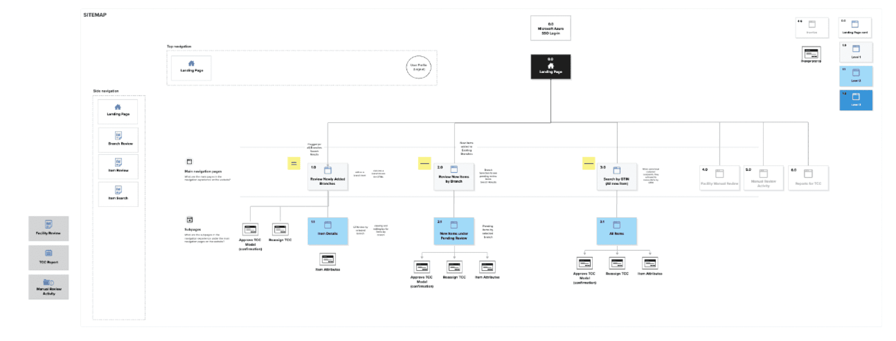
Sitemap
Information architecture
Tax experts were already moving between systems and unclear workflow structures constantly. We addressed the decision points and cross-system integration with a sitemap and end-to-end process flow to define a predictable review path before designing any UI. Process flow addressed temporal navigation. The sitemap addressed spatial navigation.
Navigation emerged as a critical user pain point.
To task users with a novel tool on top of their daily workload,
it was critical for our team to minimize the learnability curve,
any confusion and unnecessary steps.
Iteration
Continuous discovery with the Tax Team every week allowed us to gradually align and validate design decisions.
Due to constant data reconfigurations, the team went through several ideations involving continuous discovery with users for validation, not willing to compromise transparency, traceability, and efficiency.
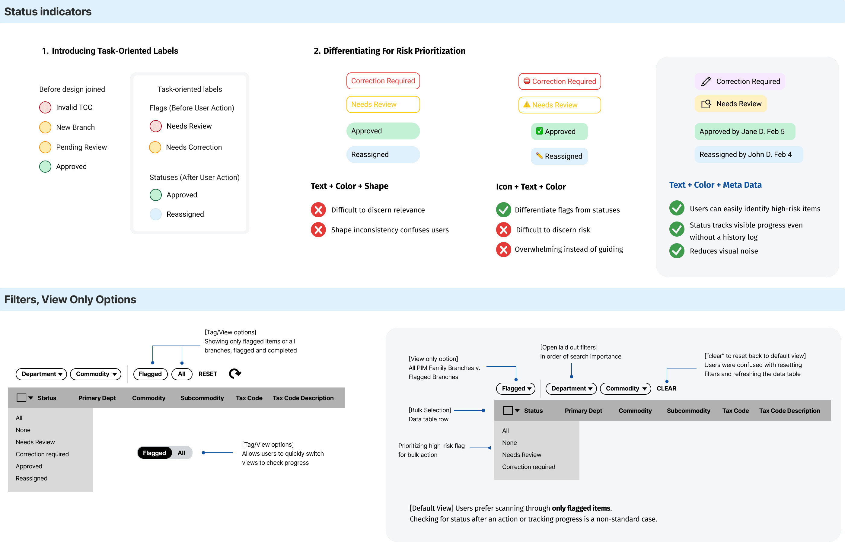
The key iterations we focused on were status indicators and features to narrow down search. With Error Recognition Think-Aloud Testing, 1 out of 5 users correctly identified the error type and knew what action to take with the original statuses. Misinterpretations clustered around severity of indicators and viewing options, which informed design revision.
Our A/B testing goal - high-risk cases need to be identifiable within seconds to create groupings
Correcting branches, yet alone item-level cases one-by-one couldn't keep up with volume without adding headcount. We continued our focus on consistent bulk selection and correction workflow for similar items, quick approve action for obvious passes.
Old mental model
48 clicks ~14-16 minutes
New mental model
8 clicks ~2-4 minutes
Scans items for edge cases
Selects similar branches
Resolve
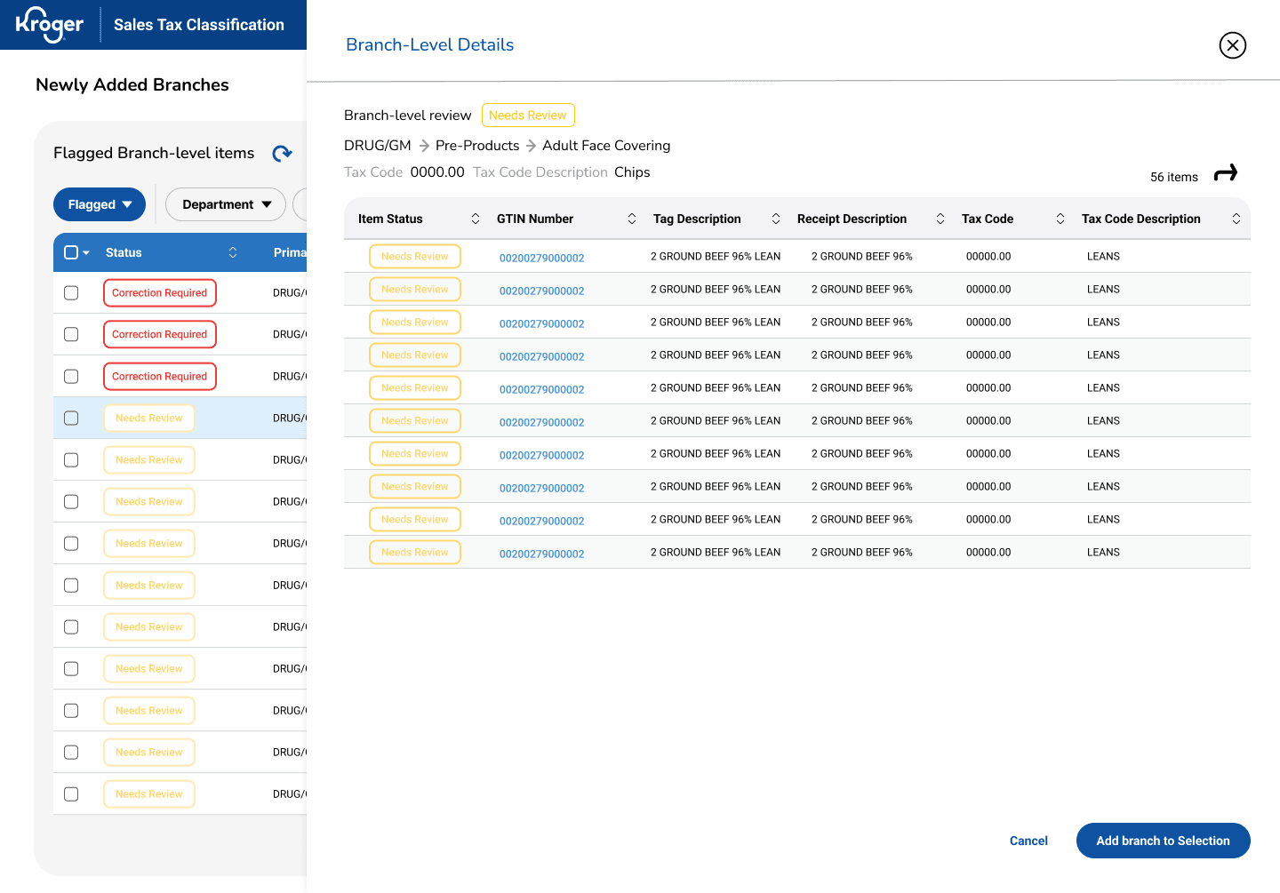
[Add branch to selection]
To reduce decision fatigue, users can only scan and decide to select the branch
[Apply to all items]
Users can correct for all items in the branch
[Quick Approve]
Users can fast-track clear approvals
Continuing to evolve the correction flow, we simplified as many clicks and unnecessary jargon.
Due to a company reorg, my efforts stopped after final design handoffs and later informed a business estimation of $500-700K annually in operational cost savings (based on labor hours reclaimed across sales tax team). In it’s early-stage process formalization, success was tracked through adoption then continued by quantitative KPIs.
IMPACT
83% fewer clicks, 80% time saved, $500K reclaimed.
You don't need to know everything to design the right solution.
As a solo designer, it’s easy to drown into tax domain complexity but I realized my job was to understand the workflow, not the subject matter or tax law. I had understand what experts needed to trust a new tool.
takeaways
Speed without validation creates expensive mistakes.
1
2
Kroger's rapid iteration culture and partnership with third-party engineers can lead to tunnel visioning on deliverables. Even in resource-constrained environments, I learned that advocating more time on feature exploration would’ve prevented compounding rework after the data reconfiguration.
What this project taught me
We put it to the test with our power users, evaluating task accuracy, speed, and perceived effort. The results confirmed the final design delivered to surface critical information quickly even for first-time users.
Users performed bulk corrections with the original workflow then repeated the task with our new design, resulting in 83% fewer interactions and 80% faster on task time. Managing exceptions daily, this meant reclaiming hours for higher-value work.
83% reduction in clicks,
80% time savings.
Users scored an average 6 (low perceived effort) on the Single Ease Question scale, indicating users found the interface intuitive and easy to use.
This validates the design's core goal of minimizing friction.
Near perfect ease.
6 out of 7 SEQ.
putting the design to the test
The final design had to earn user confidence.
I led a collaborative silent sketching workshop with my product manager, UX researcher, 2 Tech Leads, and 2 developers to ideate from our research and brainstorming sessions. We aligned on user’s goals, pain points, technical constraints and focus features:


Initial Exploration
ideation
With the data and functional team, we listed as many possible solutions answering our two HMW questions, enabling fast expert decision and using existing data systems. And, with an internal company audit we took into consideration how other teams at Kroger solved similar problems and to integrate their tools as possible solutions. Our main brainstorming results:
We landed on a custom review application to replace fragmented spreadsheets and manual workflows.
Separate status from action signals
Create clear status indicators for items needing a new tax code v. those requiring correction.
Design for threshold-based alerts
Introduce a threshold-based in-app and email alerts triggered.
View all statuses v. flagged items
Enable switching from data views for users to track progress before implementing a full change history.
Reduce unnecessary workload
Offload facility address inaccuracies to an existing tool so tax experts could focus on judgment-heavy classification tasks.
Match the interface to how users scan & decide.
Tax experts triage most efficiently with vertical visual hierarchies. Structured data table > card-based horizontal layouts.
Make filters visible/immediately usable
Hidden filters slow down experts, so surface frequently used filters in an open, always-visible layout.
If I had another month...
next steps
Through ongoing roadmap workshops, I’d prioritize quick wins while evaluating AI-powered tax code suggestive groupings benefiting users and inform future systems.
Balancing immediate needs with future vision
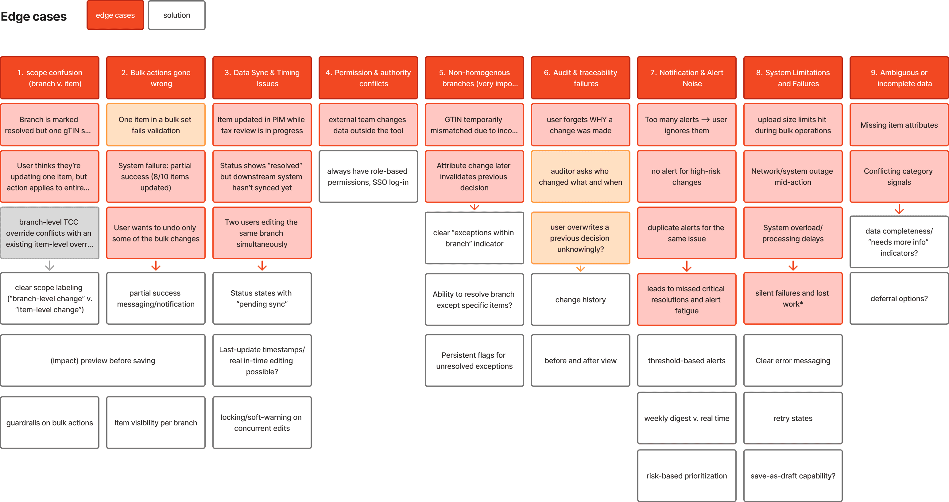
Using our Feature and UX Roadmap, we're tightening edge case handling based on impact and longevity, avoiding over-investment in issues that may resolve once the new POS system is fully integrated.
Refining edge cases strategically


Potential AI suggestive action
Working with predetermined data hierarchies and interaction patterns shaped our iterative approach. Our data structure required a branch-to-item hierarchy, meaning users couldn't immediately see all flagged exceptions across the system. Instead, they had to navigate through branch-level rows to access the item-level cases within them.
Core Limitation working around existing infrastructure.
We merged the workflows into a tiered layout, a side panel for quick scanning. This prioritized high-impact branch corrections first while providing clear drill-down for item-level edge cases.
[Branch-Level]
[Item-Level Details]
Our Response

Initial State
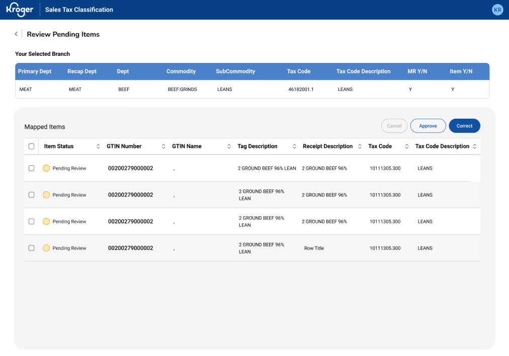
[Branch Selection]
[Branch Correction]
[Item Details]
We separated branch- from item-level exceptions in the interface to help breakdown workload but after the new data configuration, this design became redundant:
Users had to click into each branch to see flagged items in two separate workflows.

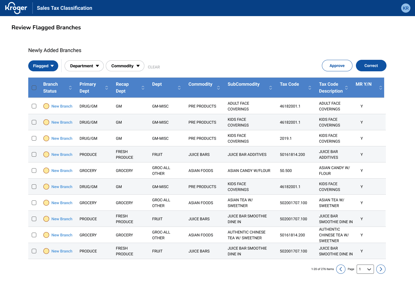
[Default
Sort by Risk]
Fast scan for risk prioritization
[Persistent, visible filtering]
Allows quick scanning, reducing decision fatigue
[Bulk selection]
Enables grouping similar cases for batch resolution
[Clear action buttons]
Consistent placement reduces cognitive load during high-volume review
My Role
Brought on as a full-stack solo product designer, I was tasked with exploring solutions so that expert tax review is efficient enough to handle at scale, reducing 15% of flagged cases without overwhelming the team's capacity or further compromising tax compliance.
Enable tax experts to quickly identify, prioritize, and resolve high risk cases without adding headcount?
Resolve exceptions using existing systems and data without rebuilding the tax automation infrastructure?
How might we
How might we
Final prototype
(For NDA purposes, I have obfuscated confidential material and all information in this case study is my own. Final screens and this case study does not necessarily reflect the views of Kroger).
Kroger Sales Tax POS Compliance Tool
Role
Full-stack Solo
Product Designer
1 PM
1 scrum master
2 tech Leads
3 developers
2 Business Sponsor
Functional Team
Data Team
Team
Timeline
Oct 2023 - June 2024
Contributions
Product Strategy
UX Research & Testing
Interaction Design
Wireframing
Design Systems
Facilitating
Prototyping
Automation found the errors. Experts had to fix them. We made it possible.
When Kroger introduced new automated tax classification services for 3 million products, this transition created a growing business risk: 18-20% of newly added products and store locations were flagged for potential errors. This created thousands of daily exceptions and significant audit exposure.
I owned the research and product design of a management platform to resolve tax code inconsistencies for Kroger’s incoming products by aligning user mental models with system requirements, reducing 15% tax code errors.
TL;DR
The challenge
The bottleneck was expert review capacity, not detection.
Tax experts were already the most accurate reviewers in the system but they had no way to work at the scale the system demanded. Kroger’s internal automation processes surfaced potential errors but couldn’t decide which ones mattered first, or why. So, we decided to amplify the Corporate Sales Tax Team’s decision-making. The real problem wasn't detection. It was capacity, confidence, and control.
Main Table View
Identifying and prioritizing high-risk cases
the solution
For users processing hundreds of items daily, we optimized pattern recognition with a visual flagging system that surfaces invalid tax codes immediately and a data table design for fast batch decision-making rather than forcing individual evaluation of every row. Marked below are key affordances allowing quick decision-making for high-volume workflows.
83% fewer clicks, 80% time saved, $500K–700K reclaimed.
[View only
Flagged v. All Items]
Reduces context switching & users can track progress
[Risk flag indicators]
Color-coded flags highlighting invalid items during scan reduces context switching
[Strategic column order]
High-priority info placed leftmost
[Statuses v. Flags]
Clear row hierarchy guides eye to the most important data first
Users sifts through lists and errors aren’t consistently categorized so cognitive effort goes into finding instead of resolving the items.
Prioritization is unclear.
Store addresses and company codes trigger separate manual correction, so there are actually TWO review workflows:
1. Item Review and 2. Facility Review.
Facility errors are a separate but parallel problem.
User’s current workflow is fragmented and excel-heavy. The problem isn’t volume alone but poor visibility into all that noise.
Friction is in navigation & data consolidation.
Users need to feel confident maintaining data accuracy and handling special cases.
So, transparency matters more than speed.
Experts need confidence & traceability.
User research
Through several stakeholder and user interviews, I discovered the challenge wasn’t tax calculation but managing exceptions at scale. Experts were already working across multiple systems and with limited visibility, users had to resort to manual reconciliation using only excel files as well as these other main pain points:
How do you build a scalable compliance tool for experts who were NEVER part of the original workflow?
planning for product evolution
Before further user testing on current workflows, the team workshopped technical limitations for our generated features and finalizing our vision and phases with a MoSCow Analysis and a UX Roadmap, we were able to get leadership buy-in for our current scope, near future, and future alignment:
Impact Effort Matrix
defining scope
Given timeline and integration constraints, with my PM and 2 Tech Leads, I prioritized these features to improve expert visibility and decision-making first for MVP before pursuing any deeper automation.
These insights led to requirements focused on centralized visibility, prioritization and confident decision-making.
Process Flow
Sitemap
Information architecture
Tax experts were already moving between systems and unclear workflow structures constantly. We addressed the decision points and cross-system integration with a sitemap and end-to-end process flow to define a predictable review path before designing any UI. Process flow addressed temporal navigation. The sitemap addressed spatial navigation.
Navigation emerged as a critical user pain point.
To task users with a novel tool on top of their daily workload,
it was critical for our team to minimize the learnability curve,
any confusion and unnecessary steps.
Iteration
Continuous discovery with the Tax Team every week allowed us to gradually align and validate design decisions.
Due to constant data reconfigurations, the team went through several ideations involving continuous discovery with users for validation, not willing to compromise transparency, traceability, and efficiency.
The key iterations we focused on were status indicators and features to narrow down search. With Error Recognition Think-Aloud Testing, 1 out of 5 users correctly identified the error type and knew what action to take with the original statuses. Misinterpretations clustered around severity of indicators and viewing options, which informed design revision.
Our A/B testing goal - high-risk cases need to be identifiable within seconds to create groupings
Correcting branches, yet alone item-level cases one-by-one couldn't keep up with volume without adding headcount. We continued our focus on consistent bulk selection and correction workflow for similar items, quick approve action for obvious passes.
Old mental model
48 clicks ~14-16 minutes
New mental model
8 clicks ~2-4 minutes
Scans items for edge cases
Selects similar branches
Resolve
[Add branch to selection]
To reduce decision fatigue, users can only scan and decide to select the branch
[Apply to all items]
Users can correct for all items in the branch
[Quick Approve]
Users can fast-track clear approvals
Continuing to evolve the correction flow, we simplified as many clicks and unnecessary jargon.
Due to a company reorg, my efforts stopped after final design handoffs and later informed a business estimation of $500-700K annually in operational cost savings (based on labor hours reclaimed across sales tax team). In it’s early-stage process formalization, success was tracked through adoption then continued by quantitative KPIs.
IMPACT
83% fewer clicks, 80% time saved, $500K reclaimed.
You don't need to know everything to design the right solution.
As a solo designer, it’s easy to drown into tax domain complexity but I realized my job was to understand the workflow, not the subject matter or tax law. I had understand what experts needed to trust a new tool.
takeaways
Speed without validation creates expensive mistakes.
1
2
Kroger's rapid iteration culture and partnership with third-party engineers can lead to tunnel visioning on deliverables. Even in resource-constrained environments, I learned that advocating more time on feature exploration would’ve prevented compounding rework after the data reconfiguration.
What this project taught me
We put it to the test with our power users, evaluating task accuracy, speed, and perceived effort. The results confirmed the final design delivered to surface critical information quickly even for first-time users.
Users performed bulk corrections with the original workflow then repeated the task with our new design, resulting in 83% fewer interactions and 80% faster on task time. Managing exceptions daily, this meant reclaiming hours for higher-value work.
83% reduction in clicks,
80% time savings.
Users scored an average 6 (low perceived effort) on the Single Ease Question scale, indicating users found the interface intuitive and easy to use.
This validates the design's core goal of minimizing friction.
Near perfect ease.
6 out of 7 SEQ.
putting the design to the test
The final design had to earn user confidence.
I led a collaborative silent sketching workshop with my product manager, UX researcher, 2 Tech Leads, and 2 developers to ideate from our research and brainstorming sessions. We aligned on user’s goals, pain points, technical constraints and focus features:
Initial Exploration
ideation
With the data and functional team, we listed as many possible solutions answering our two HMW questions, enabling fast expert decision and using existing data systems. And, with an internal company audit we took into consideration how other teams at Kroger solved similar problems and to integrate their tools as possible solutions. Our main brainstorming results:
We landed on a custom review application to replace fragmented spreadsheets and manual workflows.
Separate status from action signals
Create clear status indicators for items needing a new tax code v. those requiring correction.
Design for threshold-based alerts
Introduce a threshold-based in-app and email alerts triggered.
View all statuses v. flagged items
Enable switching from data views for users to track progress before implementing a full change history.
Reduce unnecessary workload
Offload facility address inaccuracies to an existing tool so tax experts could focus on judgment-heavy classification tasks.
Match the interface to how users scan & decide.
Tax experts triage most efficiently with vertical visual hierarchies. Structured data table > card-based horizontal layouts.
Make filters visible/immediately usable
Hidden filters slow down experts, so surface frequently used filters in an open, always-visible layout.
If I had another month...
next steps
Through ongoing roadmap workshops, I’d prioritize quick wins while evaluating AI-powered tax code suggestive groupings benefiting users and inform future systems.
Balancing immediate needs with future vision
Using our Feature and UX Roadmap, we're tightening edge case handling based on impact and longevity, avoiding over-investment in issues that may resolve once the new POS system is fully integrated.
Refining edge cases strategically
Potential AI suggestive action
Working with predetermined data hierarchies and interaction patterns shaped our iterative approach. Our data structure required a branch-to-item hierarchy, meaning users couldn't immediately see all flagged exceptions across the system. Instead, they had to navigate through branch-level rows to access the item-level cases within them.
Core Limitation working around existing infrastructure.
We merged the workflows into a tiered layout, a side panel for quick scanning. This prioritized high-impact branch corrections first while providing clear drill-down for item-level edge cases.
[Branch-Level]
[Item-Level Details]
Our Response
Initial State
[Branch Selection]
[Branch Correction]
[Item Details]
We separated branch- from item-level exceptions in the interface to help breakdown workload but after the new data configuration, this design became redundant:
Users had to click into each branch to see flagged items in two separate workflows.
[Default
Sort by Risk]
Fast scan for risk prioritization
[Persistent, visible filtering]
Allows quick scanning, reducing decision fatigue
[Bulk selection]
Enables grouping similar cases for batch resolution
[Clear action buttons]
Consistent placement reduces cognitive load during high-volume review

Made with
by Christine ©2026